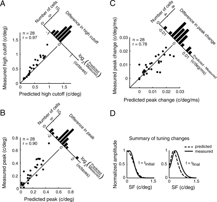
Figure 7.
Population comparison of predicted and measured SF tuning. A, Scatter plot of predicted and measured high cutoff values for a sample of 28 neurons. There is a strong correlation (r = 0.97; p < 10−15, linear regression), although predictions clearly deviate from measurements. The differences between these values, computed as the log ratio of predicted SFhigh to measured SFhigh, are displayed in a histogram (top right). The mean difference is significantly different from zero (−0.22 ± 0.04 octaves, mean ± SEM; p < 10−5, two-tailed t test). B, Scatter plot of average predicted tuning peaks and measured tuning peaks. The data are highly correlated (r = 0.90; p < 10−9, linear regression) and most points lie above the y = x line, indicating a higher peak when SF tuning was measured directly. The mean difference, computed analogously to the difference in high cutoff, is significantly different from zero (−0.42 ± 0.16 octaves, mean ± SEM; p < 0.05, two-tailed t test). C, Scatter plot of the predicted changes and measured changes in tuning peak. The data are well correlated (r = 0.78; p < 10−6, linear regression) and points are roughly evenly distributed above and below the unity line. The differences between predicted and measured tuning changes are symmetrically distributed around zero. The mean of this distribution (3.6 × 10⁻⁴ ± 8.5 × 10⁻⁴ c/deg/ms, mean ± SEM) is not significantly different from zero (p > 0.5, two-tailed t test). D, A summary of SF tuning dynamics over the population of cells. Both predicted (dashed line) and measured (solid line) curves show a large shift from low-pass tuning at tinitial (left) to more bandpass tuning at tfinal (right). However, for all time points, predicted tuning curves underestimate the true peak, as shown in B. Because this difference is roughly fixed over time, the predicted rate of peak change is relatively unaffected and correlates well to the measured value, as shown in C. Curves were generated by averaging the parameters of the best-fit DOG at the initial and final time point for each cell.

