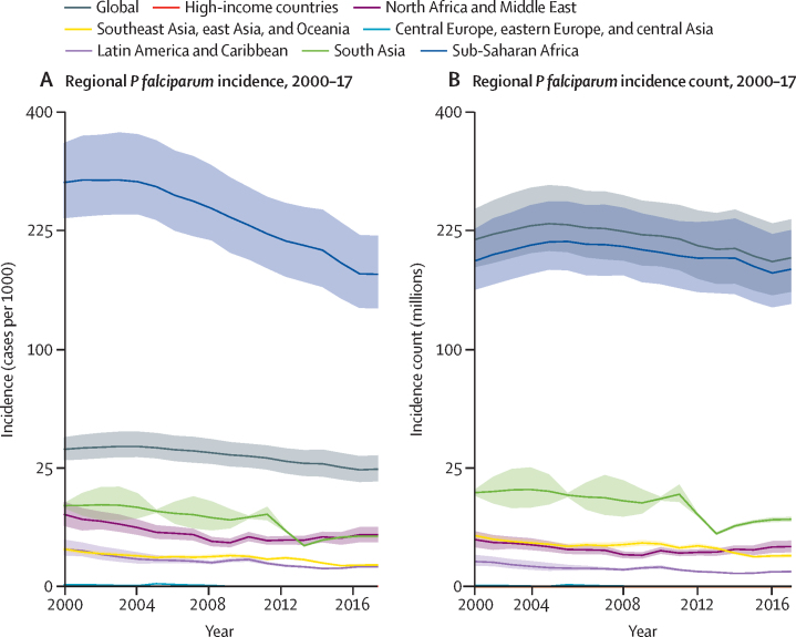
Figure 2.
Regional distribution of Plasmodium falciparum incidence (A) and count (B)
To show trends across regions with such different endemicity levels, the y-axis is scaled using the square root of incidence (per 1000 individuals) for A and count (in millions of cases) for B. 95% uncertainty intervals are shown via the corresponding coloured bands behind the mean lines. Rates were calculated using the total population in all endemic countries within each region.

