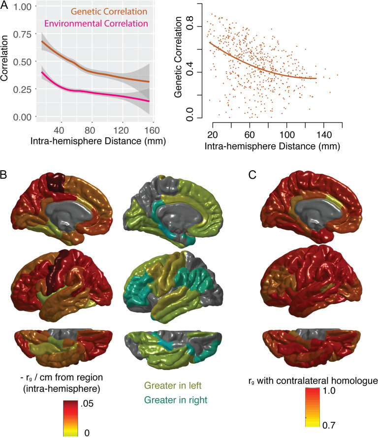
Figure 2.
The relationship between genetic correlation (ρg), anatomical distance and contralateral homology. (A) The left-hand plot shows the relationship between anatomical distance and phenotypic (total) correlation, as well as genetic correlation (ρg, the genetic component of the phenotypic correlation), and environmental correlation (the non-genetic component of the phenotypic correlation). Lines represent smoothed local averages, with standard error silhouettes (ggplot2 package in R). The right-hand plot focuses on the genetic correlation (ρg), showing the fit of a quadratic model of the relationship with distance, which is a better fit than either a linear model or an exponential decay model (see Results). These plots show correlations within the left hemisphere only. (B) For each region, the linear relationship between ρg between that region and every other region was estimated. At the regional level, the model fits were not improved by adding quadratic components. Color scheme represents the estimated decrease in ρg per cm from the region of origin. The hemispheres were averaged for the left-hand plot. The right-hand plot whether the slope of the linear relationship with distance was greater in the left hemisphere (yellows) or right hemisphere (aqua), for each region. (C) The ρg between each region and its contralateral homolog in the opposite hemisphere.

