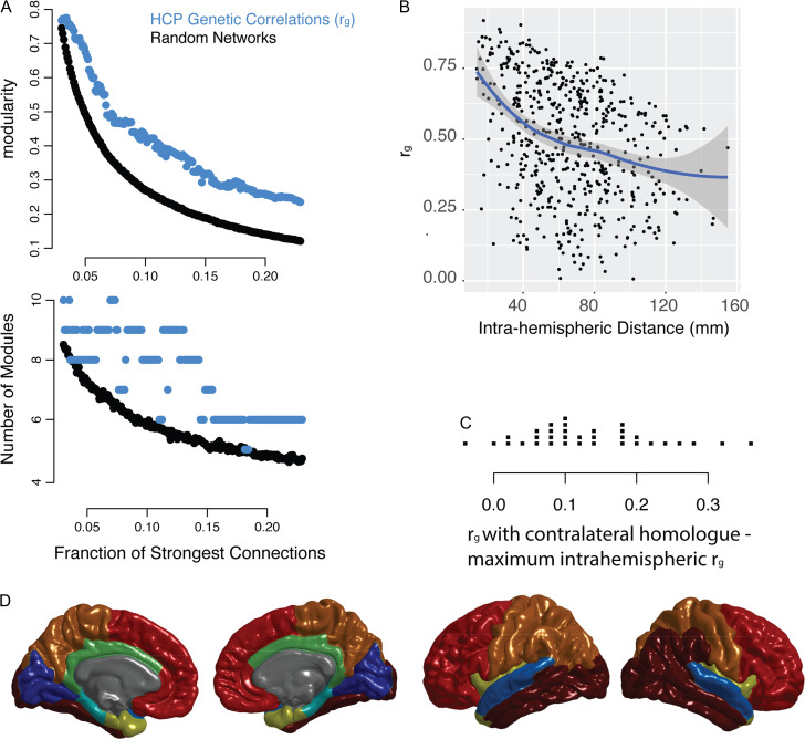
Figure 5.
Replication of key results using data from Human Connectome Project. (A) Network models (graphs) were constructed at intervals of 0.001 connections density, where the connections density refers to the fraction of the strongest connections that are included in the graph. The genetic correlation networks are shown in addition to random control networks (see Methods). The top plot shows modularity, a measure of the strength of the community structure of the network, which is significantly higher in the genetic correlation network compared to the random network. The bottom plot shows the optimal number of modules at each density. For comparison with GOBS data, see Figure 1B. (B) An illustration of the consensus partition (modular community structure) with 8 cortical modules (For comparison with GOBS data, see Fig. 1C). (C) The relationship between anatomical distance and the genetic correlation between brain regions, shown for the left hemisphere. The line represents smoothed local averages, with standard error silhouettes (ggplot2 package in R). The right-hand plot focuses on the genetic correlation (ρg), showing the fit of a quadratic model of the relationship with distance, which is a better fit than either a linear model or an exponential decay model (see results). For comparison with GOBS data, see Figure 2A. (D) For each of the FreeSurfer regions, the strip chart shows the difference between ρg with the contralateral homolog and the maximum within-hemisphere ρg.

