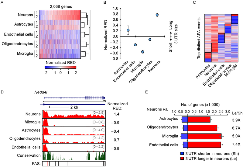
Figure 2. APA differences among brain cells.
(A) Heat map of APA profiles of different brain cells. Normalized RED values by standardization across samples are shown in the heat map. RED is based on comparison of each sample with the mean of all samples. The first conserved PAS was used as the reference PAS for RED calculation. A total of 2,068 genes are shown. Samples are clustered using Pearson correlation as a metric and genes are sorted by the mean RED values of neurons. (B) Median normalized RED values of each cell type. Two replicates for each cell type were averaged for plotting. Error bars are standard deviation of two replicates. (C) Heatmap of top distinct APA events of different cell types. Distinct APA events were selected by Wilcoxon test comparing RED values of one cell type with those of other cell types (see Methods for detail). (D) An example gene Nedd4l shown in UCSC genome browser, which showed longest 3′ UTRs in neurons. The reference PAS is indicated by a red line. Other conserved (black) and non-conserved (gray) PASs also indicated. The conservation track is based on seven mammalian species (rat, human, orangutan, horse, dog, chicken, and opossum). (E) Bar graph showing the number of genes with significantly shortened (blue) or lengthened (red) 3′ UTRs (P<0.05, DEXSeq) in neurons vs. another cell type. The most significant 3′ UTR PAS was used as the reference for analysis. The ratio of number of 3′ UTR lengthened genes to number of 3′ UTR shortened genes for each cell type is indicated. Error bars are standard deviation obtained by bootstrapping (see Methods for detail).

