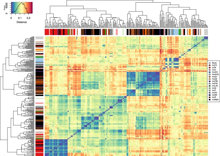
Figure 2.
Heatmap diagram of the distances between the individual 257 representative plasmids plotted using the heatmap.2 function in R. The blue/red gradient represents the estimated Mash distance (legend at the top left, reflects the amount of data corresponding to each colour/distance). Dark blue indicates closely related representatives with similar gene content but different gene arrangements. On the X and Y axes, the 257 representatives were arranged based on their distance to each other, and the branches are annotated with colours that correspond to the different plasmid incompatibility groups (legend on the right).

