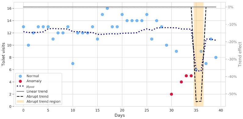
Figure 3.
Analysis of toilet count data by a rolling Poisson regression model: blue dotted line represents the predicted mean counts. A significant abrupt trend is detected in the last days (the region is highlighted by the orange area, whereas the effect of the abrupt trend is shown by the black dashed line, along with the linear one, in solid gray). Data points not properly explained by the model are highlighted in red.

