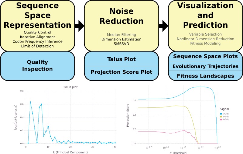
Figure 1.
Top: The DISSEQT pipeline. The yellow boxes represent algorithms and data management. The blue boxes represent plots and other output. The analysis history of all results and plots can be traced back all the way to the raw input data. Steps that are only used in some analyses are displayed in gray text. Sequence Space Representation: Per sample raw sequencing data is passed through automatic quality control and aligned to a reference genome. Codon frequencies are inferred using quality scores in the aligned data and the limit of detection is estimated for each codon at each site. These are combined to form the sequence space representation. Consensus change reports and read coverage plots aid manual quality inspection. Noise Reduction: Median filtering along the time axis is used for time series data. Talus plots are used for dimension estimation and SMSSVD reduces the dimension robustly. Visualization and Prediction: Variable selection can be used for finding a small subset of explanatory variables. Nonlinear dimension reduction captures important features for low dimensional visualization of sequence space. Evolutionary trajectories are described in both sample and variable space. Fitness landscape models are used for visualization and prediction. Bottom left: Talus plot for the SynSyn data set. After thirteen dimensions, the Talus plot shows small variations around a low mean. Bottom right: Projection Score Plot for the SynSyn data set. SMSSVD finds three signals of Dimensions 3, 5, and 5 with different optima for variance filtering. Each curve displays the projection score of a signal as a function of the variance filtering threshold.

