
Figure 2.
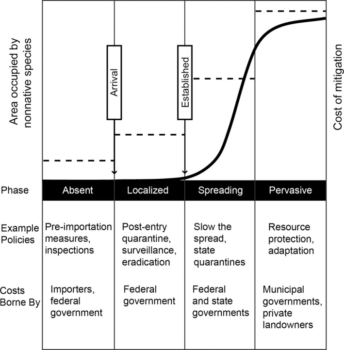
Generalized pattern of spread of an introduced invasive species. The solid curve represents a typical pattern of increasing area occupied by an invasive species, vertical lines delineate the different phases of the invasion, and horizontal dashed lines represent hypothetical costs of mitigation in the different phases. The text below the graph gives examples of policies that are often used in the different phases, and who bears the greatest burden of the costs of those polices. Graph modified from Hobbs and Humphries (1995).