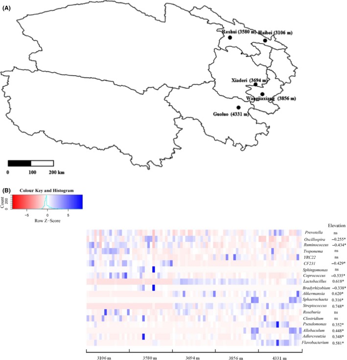
Figure 1.

Schematic diagram of five sampling sites (A) and the abundance distribution of major genera in pika gut across elevations and their correlation with elevation (B). The relative abundance of these genera was normalized using Z‐score transformation. The blue colour in the heatmap means higher relative abundance of the corresponding genera, while the red colour means less abundant for the relative abundance. Only those genera with mean relative abundance > 0.05% across all samples are shown. Spearman correlation analysis was used to detect the correlation between the relative abundance of these genera and elevation. The symbol (*) means significant correlations with P < 0.05. NS signifies no significance.
