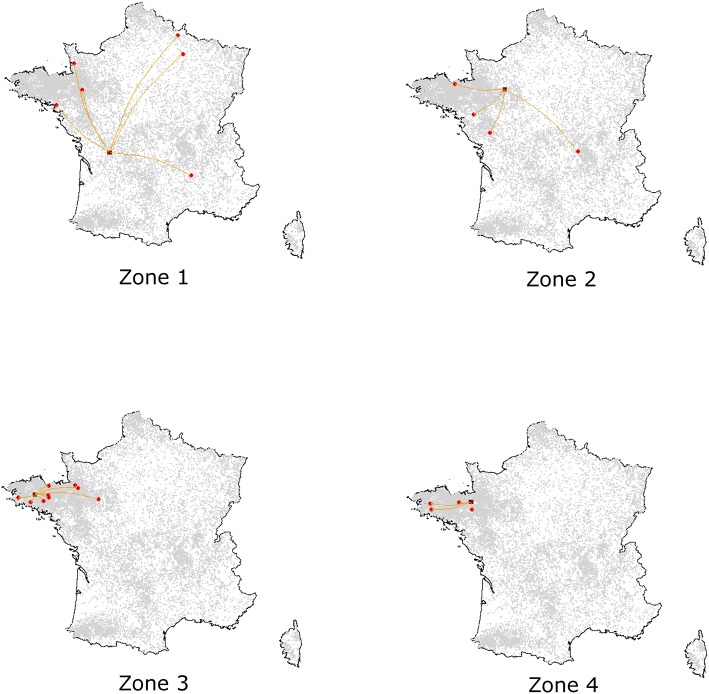
Figure 6.
Illustration of simulated epidemics according to the density of the zone of introduction, assuming an introduction into Nucleus, Multiplier or Farrowing herds. For each introduction zone, one simulation was randomly selected among those with effective transmission events. Dark red squares represent the seeder herds while red spots correspond to the secondary outbreaks.

