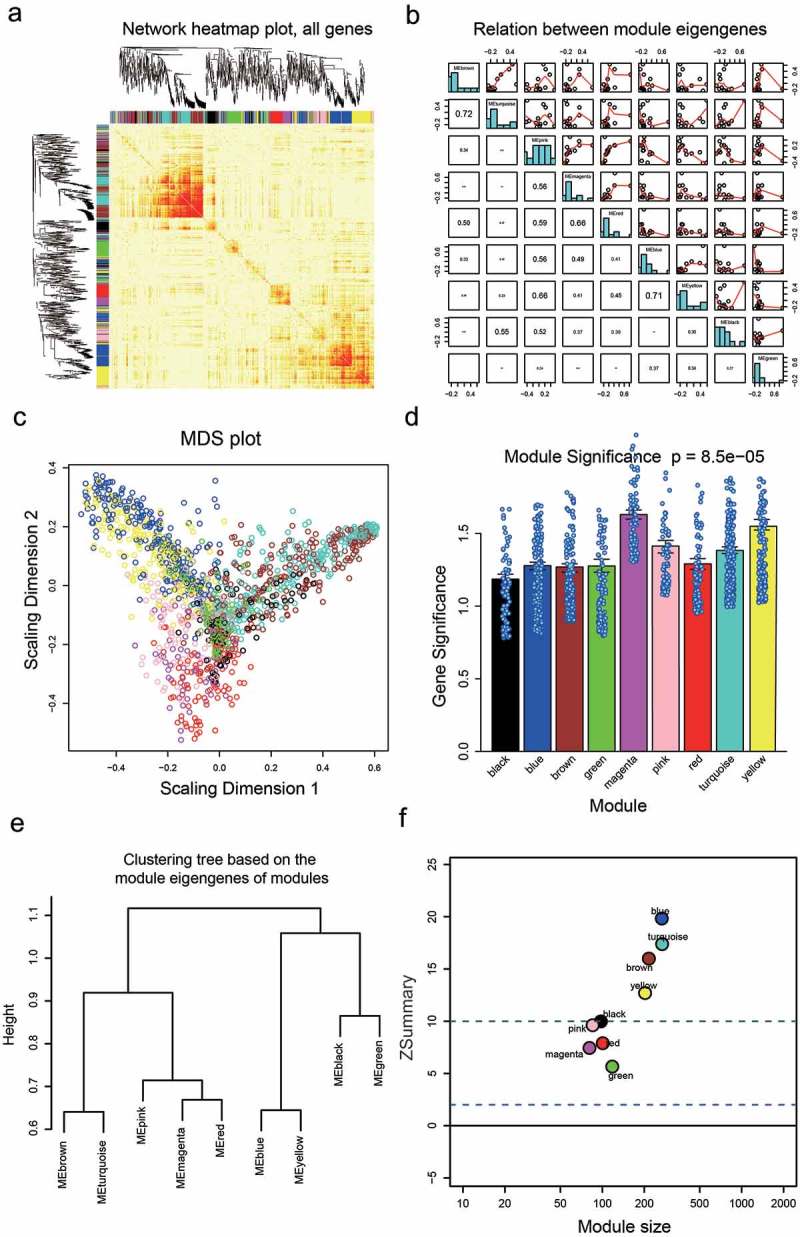
Figure 2.

Network visualization plots. (a) Visualization of the gene network using a heat map plot. The heat map depicted the Topological Overlap Matrix (TOM) among all genes in the analysis. Light color represented low overlap and progressively darker red color represents higher overlap. Blocks of dark colors along the diagonal are the modules. The gene dendrogram and module assignment were also shown along the left side and the top. (b) Pairwise scatterplots of module eigengenes and the trait y. (c) Multi-dimensional scaling plot in which modules tend to correspond to “fingers”. Intramodular hubs are in the fingertips. (d) Barplot of mean gene significance across modules. The higher the mean gene significance in a module, the more significantly relative the module is to the clinical trait of interest. (e) Hierarchical clustering dendrogram of module eigengenes. The brown and turquoise, the blue and yellow, the magenta and red are highly related, as evidenced by their low merging height. (f) Corresponding Z summary scores and module size of different modules reflect the preservation of modules.
