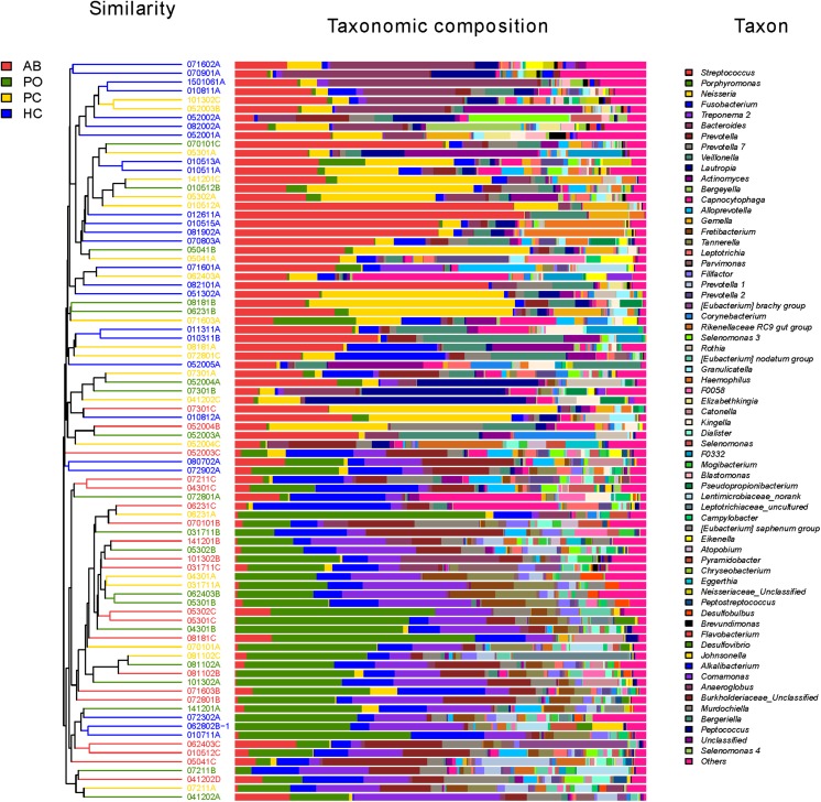
FIGURE 2.
Microbial community bar plot at the genus level with cluster tree. Each line shows the results of the bacterial community of one sample. Different bacterial taxonomies at the genus level (cutoff was set as 1%; some below 1% were shown as “others”) are shown in different colors on the right. The hierarchical cluster diagrams in all samples based on the community composition (based on the algorithm of Bray–Curtis) is shown on the left. Red color indicates that the specimen is in the AB group. Green color indicates that the specimen is in the pocket (PO) group. Yellow color indicates that the specimen is in the healthy control (HC). Blue color indicates that the specimen is in the patient control (PC).

