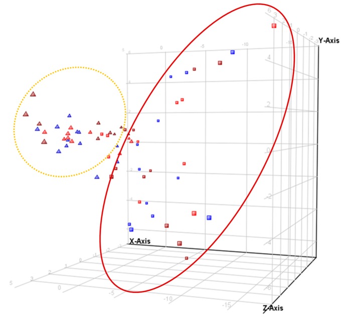
Figure 1.
3D-PCA score plot for serum samples. Red (Group A), blue (Group X), and burgundy (Group A+X) triangles represent samples before intervention (time 0) and red, blue, and burgundy blocks after the 8-months intervention. X-axis represents component 1 (45.96%), Y-axis is component 2 (11.84%) and Z-axis, component 3 (6.78%).

