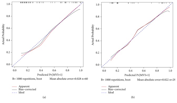
Figure 3.
Calibration curves for the nomogram in estimating the risk of MVI in the training and validation groups. On the calibration curve, the x-axis is the nomogram-predicted probability of MVI, and the y-axis is the actual probability. The dotted blue line represents the ideal curve, the red line is the nomogram curve, and the black line is the bias-corrected curve.

