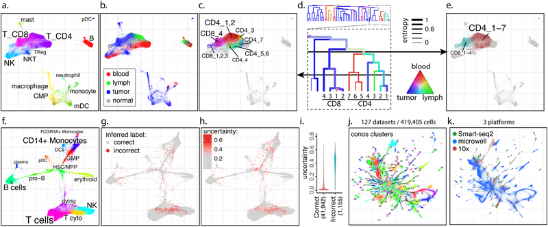
Figure 2. Examples of analyses using joint graphs.
a-e. Trade-off between cluster resolution and sample breadth. Joint graph is shown for n=15 samples from eight breast cancer patients9 (a). The distribution of source tissues (b). A fragment of the subpopulation hierarchy is shown for T cells subsets (d), with color of the branches showing tissue composition, and width showing normalized sample entropy (higher entropy corresponds to more samples contributing to the branch). Depending on the level, a cut of the cluster hierarchy can yield more granular but tissue-specific clusters (c) or less granular clusters that incorporate more tissues and samples (e).
f-i. Propagation of cell annotation labels. Joint embedding of bone marrow samples from n=8 patients is shown (f). The annotations were erased from all but one sample, and propagated back to the entire dataset. Positions of the incorrectly propagated labels (g). Uncertainty of propagation, reported by Conos (h). Reported uncertainty of correctly and incorrectly propagated labels (i).
j-k. Conos integration of the Tabula Muris1 and Han et al.16 mouse atlases. Joint graph of the 127 datasets is, with colors and numbers marking top-level joint clusters (j) or scRNA-seq platforms (k).

