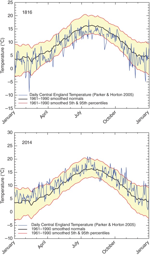
Figure 4.

Daily Central England temperatures for each day of the year for 1816 and 2014. Absolute temperatures are shown in blue and these can be compared with average values based on the 1961–1990 period. Apart from averages, the panels for the 2 years also show a number of percentile ranges (5/95) to illustrate how unusual some days are with respect to the distribution of individual days based on the 1961–1990 period.
