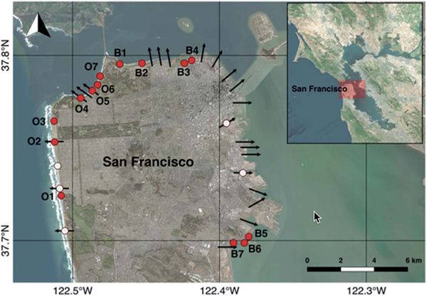
Fig. 1.

Sampling stations and CSD locations around San Francisco. Red circles represent weekly monitoring stations. White circles represent stations sampled only when a CSD occurs. Arrows represent locations where CSDs may occur. Arrows are symbolic and arrow lengths do not correspond to CSD volumes or distance offshore of discharge. Map made in QGIS open source software (http://qgis.osgeo.org) using Bing satellite imagery.
