
Extended Data Figure 8 |. A linear trajectory explains the dynamics of cellular frequencies in healthy aging.
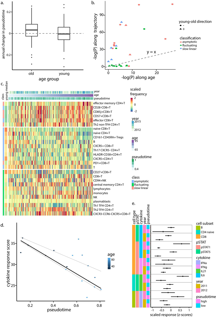
a, Annual change in pseudotime calculated for young (two-tailed binomial test p = 0.648, n = 77) and older (two-tailed binomial test p = 0.0018, n = 210) individuals. Boxes represent 25th and 75th percentiles around the median (line). Whiskers, 1.5× interquantile range. b, Linear-model-derived significance levels (n = 294 samples, calculated as -log[P]) of cellular frequencies that were regressed either versus age (x-axis) or pseudotime (y-axis). Each dot denotes a cell subset with shape corresponding to the direction of young-old differences and color corresponding to the cell subset classification. Dashed line is the y = x line. c, Scaled frequencies of cell subsets classified as asymptotic, slow linear or fluctuating (left bar) along the age axis. Median values of scaled frequencies calculated using young individuals are in the left bar. d, Cytokine response score of year 2012 samples colored by age and median regression line versus pseudotime (quantile regression P = 0.021, 0.77 (n = 17) for pseudotime and age, respectively). Quantile regression lines of quantiles 0.25 and 0.75 are shown as dashed lines. e, Scaled individual phospho-flow cytokine responses measured in years 2011–2012 in individuals positioned in either half of the trajectory as divided by the median (n = 28 and n = 6 in each group for 2011 and 2012, respectively). Dots and error bars correspond to median and s.d., respectively.