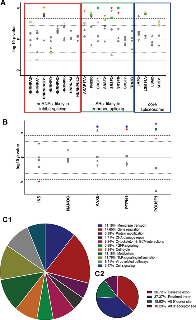
Figure 2.

(A) Effects of cell stresses on splicing factor expression. Modified Manhattan-style plot corrected for direction of effect showing the effects of cellular stressors on splicing factor expression. The y axis shows −log10 of P-value with direction of effect from data generated by TLDA cards. Bonferroni corrections were performed to take account of the number of treatments but not for the splicing regulators as these are known to be affected by cell stresses in a number of other cell types (16). Upper line infers the Bonferroni multiple testing limit. The lower dotted line gives nominal significance. Blue circles 25 mM high glucose. Green squares, 2.5 mM low glucose; Red diamonds, < 3% O2; Purple triangles, 0.5 mM PI; Orange triangles, cytokines. Upper line infers the Bonferroni multiple testing limit. The lower dotted line gives nominal significance. (B) Effects of cell insult treatments on alternatively spliced gene expression. Modified Manhattan-style plot corrected for direction of effect. The x axis refs to the ratio of alternatively expressed isoforms at each locus from data generated by qRTPCR. Ratio was calculated by dividing expression of variants by expression of canonical transcripts. The y axis shows −log10 of P-value with direction of effect. Bonferroni corrections were performed to take account of the number of time points but not for the genes in the target panel as these are a priori. Upper line infers the Bonferroni multiple testing limit. The lower dotted line gives nominal significance. Blue circles, 25 mM glucose; green squares, 2.5 mM glucose; red diamonds, < 3% O2; purple triangles, 0.5 mM PI; pink inverse triangles, cytokines; orange hexagons, 0.5 mM. (C) The proportion of alternatively spliced genes demonstrating dysregulation in islets from donors with T2D. Data generated by Clariom D pico array. (C1) Pie chart showing the cellular and molecular functions of alternatively spliced transcripts that display dysregulated splicing patterns in islets from donors with T2D compared with matched controls. (C2) Pie chart showing the nature of splicing events that are dysregulated in islets from donors with T2D compared with matched controls.
