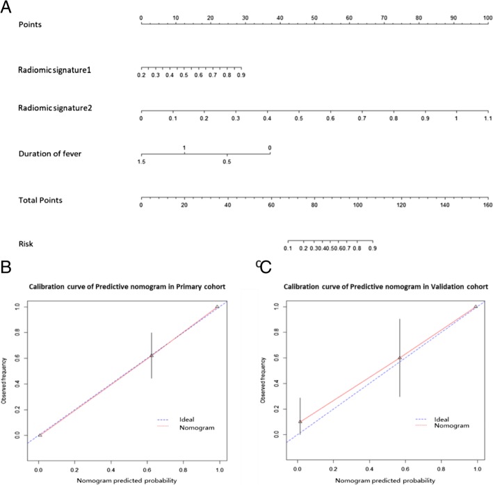
Fig. 4.
Construction and validation of predictive nomogram. (a) Predictive nomogram. (b) Calibration curve of the nomogram on primary cohort. (c) Calibration curve of the nomogram on validation cohort. The calibration curve demonstrates the agreement between the predicted risk by the nomogram and real outcomes. The 45-degree blue line represents a perfect prediction, and the red lines represent the predictive performance of the nomogram

