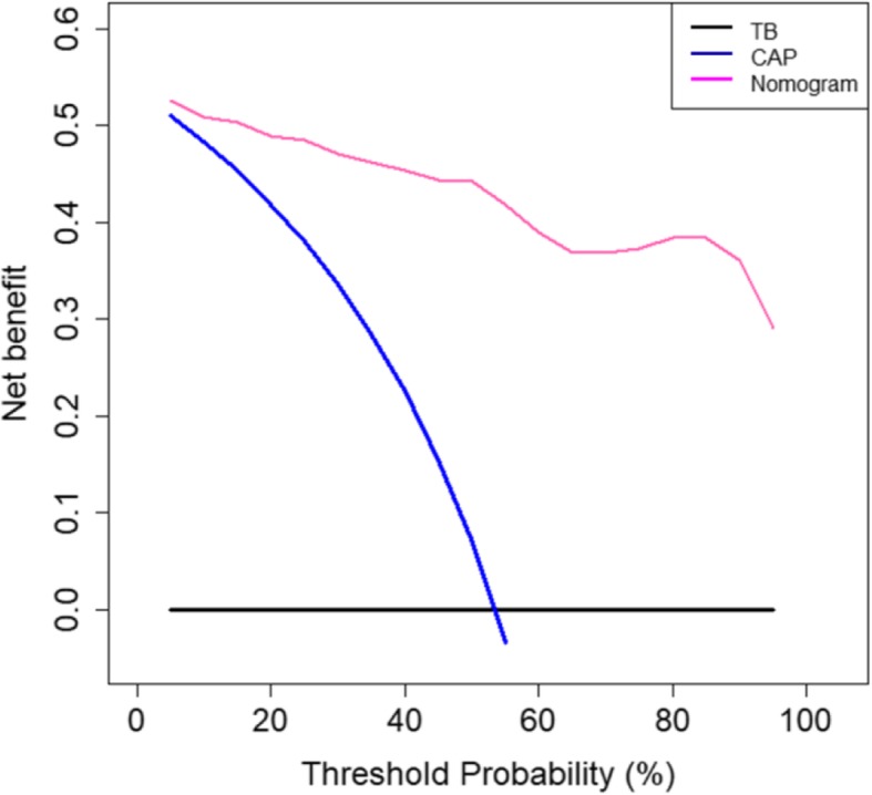
Fig. 6.

Decision curve analysis of the predictive nomogram. The x-axis and y-axis represent the threshold probability value and the net benefit, respectively. The red, blue, and black lines represent the treatment benefits using the nomogram, treating all patients as CAP, and treating all patients as pulmonary TB
