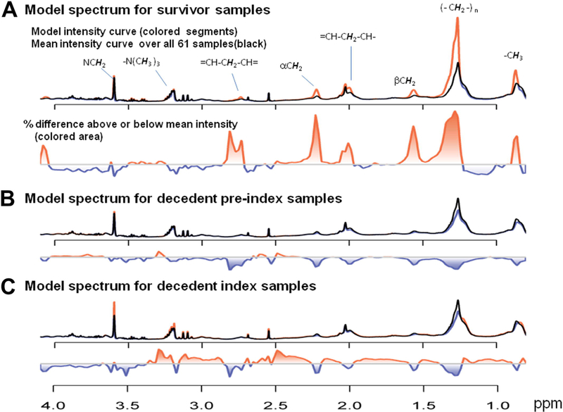
Fig 2.

Three key metabolic model spectra of the Self-Organizing Map (SOM). A, The survivor model spectrum mapped to the grid (1,5) in Fig 3, A. B, The decedent preindex model spectrum mapped to the grid (3,1) in Fig 3, B. C, The decedent index model spectrum mapped to the grid (5,3) in Fig 3, C. The red curve indicates the current metabolic model; the black curve indicates the mean spectrum over all 61 spectra, thus serving as a constant reference. The proportional differences of each metabolic model spectrum and the mean spectrum are shown by the colored area below each model spectrum.
