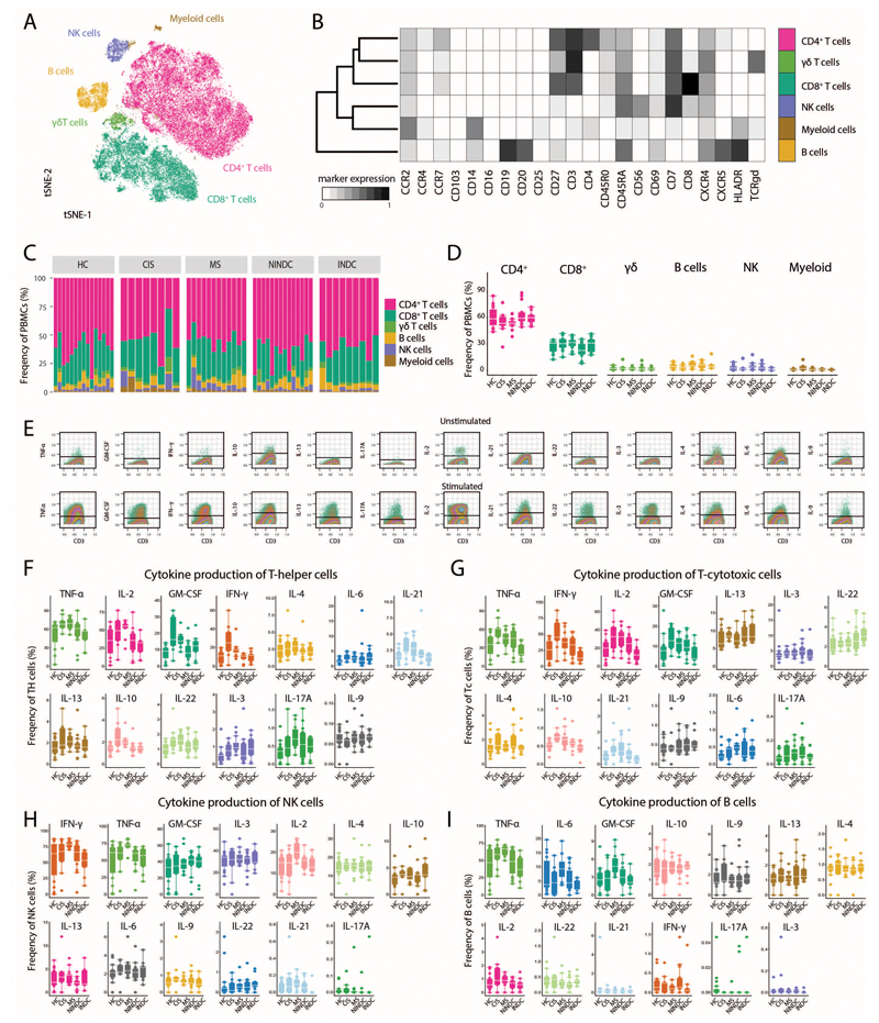
Extended Data Fig.8. Immune profiling of validation cohort.
(A) PBMCs from RRMS (n = 12), HC (n = 15), NINDC (n = 14), IDC (n = 9) and CIS (n =8) patients were restimulated with PMA/ionomycin and analyzed by mass cytometry. The tSNE algorithm (20,000 cells, randomly selected from all samples) was used to depict different populations therein. FlowSOM-based immune cell populations are overlaid as a color dimension. (B) Mean population expression levels of all markers used for tSNE visualization and FlowSOM clustering. (C) Sample specific and (D) frequencies of immune cell lineages in peripheral leukocytes in RRMS (n = 12), HC (n = 15), NINDC (n = 14), IDC (n = 9) and CIS (n =8) patients. (E) Representative plot of cytokine staining in the unstimulated control (upper) and stimulated samples (lower). Cells randomly selected from the experimental run are shown. Positivity threshold was set on the residual staining as described in the methods section. Frequencies of cytokine production by Th cells (F), Tc cells (G), NK cells (H) and B cells (I) among RRMS (n = 12), HC (n = 15), NINDC (n = 14), IDC (n = 9) and CIS (n =8) patients. Boxplots depict the IQR with a white horizontal line representing the median. Whiskers extend to the farthest data point within a maximum of 1.5x IQR. Every point represents one individual.

