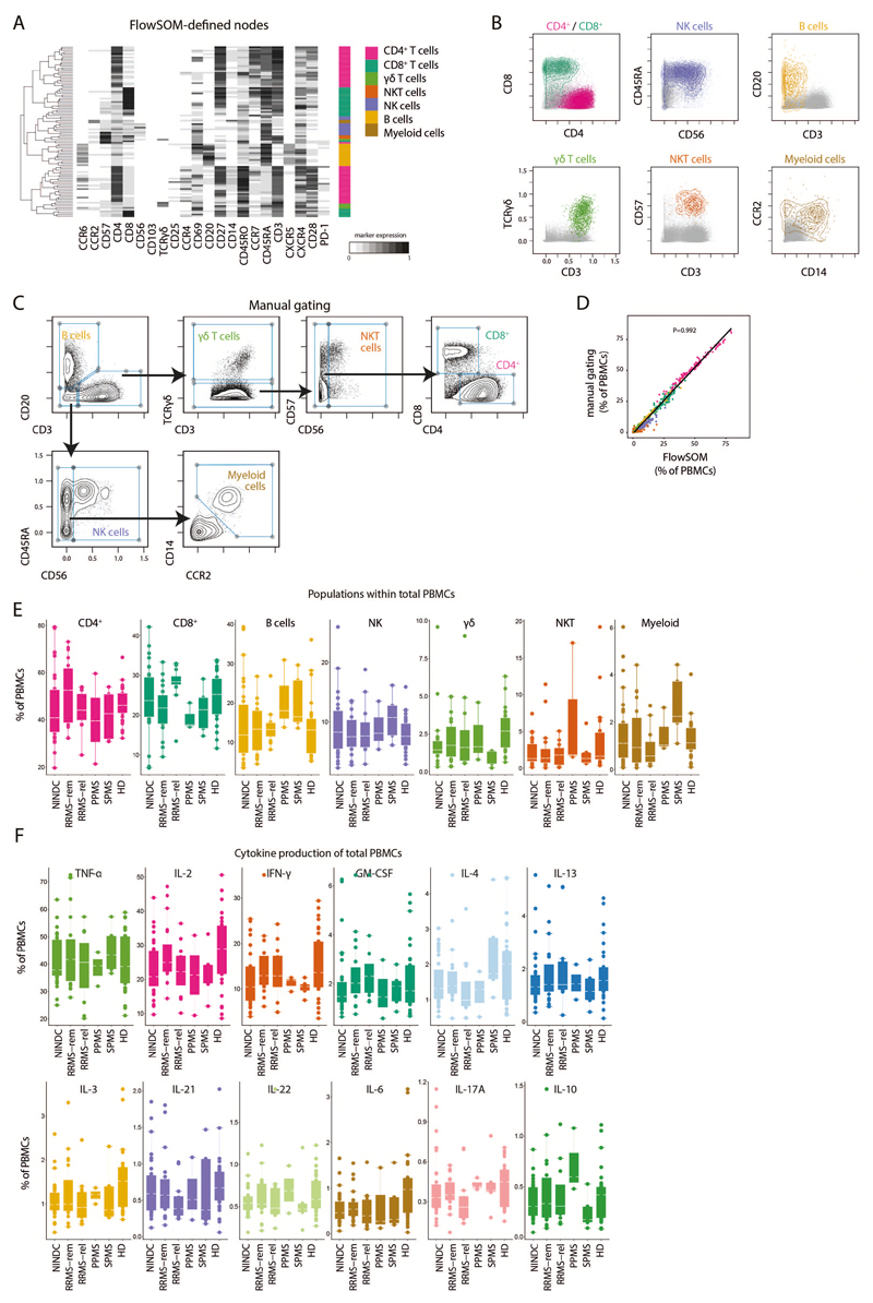
Extended Data Fig.2. FlowSOM-guided clustering of peripheral blood immune cell lineages.
(A) PBMCs from HD (n = 29) and NINDC patients (n = 31) and MS (n = 31) were restimulated with PMA/ionomycin and analyzed by mass cytometry. Heatmap of FlowSOM-identified initial nodes and their mean surface marker expression levels, together with their lineage assignment (color-coded). (B) Biaxial plots showing the expression of the main lineage markers of FlowSOM-based populations (colored). The total samples from HD (n = 29) and NINDC patients (n = 31) and MS (n = 31) is shown in grey. (C) Data as in A was manually gated to define the same populations. Samples from 3 independent runs are analyzed. (D) Correlation of frequencies for the immune populations (color-coded) as defined by FlowSOM and manual gating. Each dot represents the frequency of a leukocyte population of one donor (n = 91). P-value was calculated using linear regression. (E) Frequencies of immune cell lineages in peripheral leukocytes between NINDC (n = 31) and RRMS patients during remission (n = 18), or during relapse (n = 12), SPMS patients (n = 5), PPMS patients (n = 3) and HD (n = 29). (F) Frequencies of cytokine+ cells within PBMCs between NINDC (n = 31) and RRMS patients during remission (n = 18), or during relapse (n = 12), SPMS patients (n = 5), PPMS patients (n = 3) and HD (n = 29). Boxplots depict the interquartile range (IQR) with a horizontal line representing the median. Whiskers extend to the farthest data point within a maximum of 1.5x IQR. Points represent individuals.

