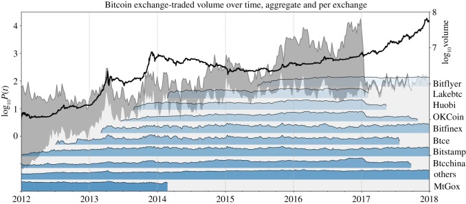
Figure 7.
The evolution of Bitcoin exchanges in terms of trading volume. The dark grey area (right scale) represents the total log-volume of all analysed exchanges. The light area shows the volume of only the exchanges that are still in business as of end 2018. The blue inset plots schematically show the evolution of traded log-volume of the single exchanges that are listed next to the right plot axis. Note that the inset plots are ordered according to the dates of entry into service of the different exchanges. Hence, from these plots, the temporal origination of exchanges can be compared. (Data Source: [50].)

