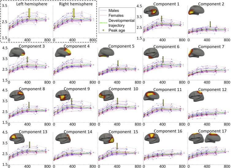
Fig. 3.
Developmental trajectories of the average CT of each hemisphere (in the top left box) and each discovered region (i.e., component) in the left hemisphere, as well as the region-specific peak ages. The corresponding result of each region in the right hemisphere is shown in SI Appendix, Fig. S4. The y axis stands for CT (1.5 to 4.5 mm for all components), and the x axis represents the age in days. Red lines and blue lines represent females and males, respectively. The dashed green curves illustrate the fitted model of the population’s trajectories. The peak point of each fitted curve is signified using a yellow hexagon and an arrow.

