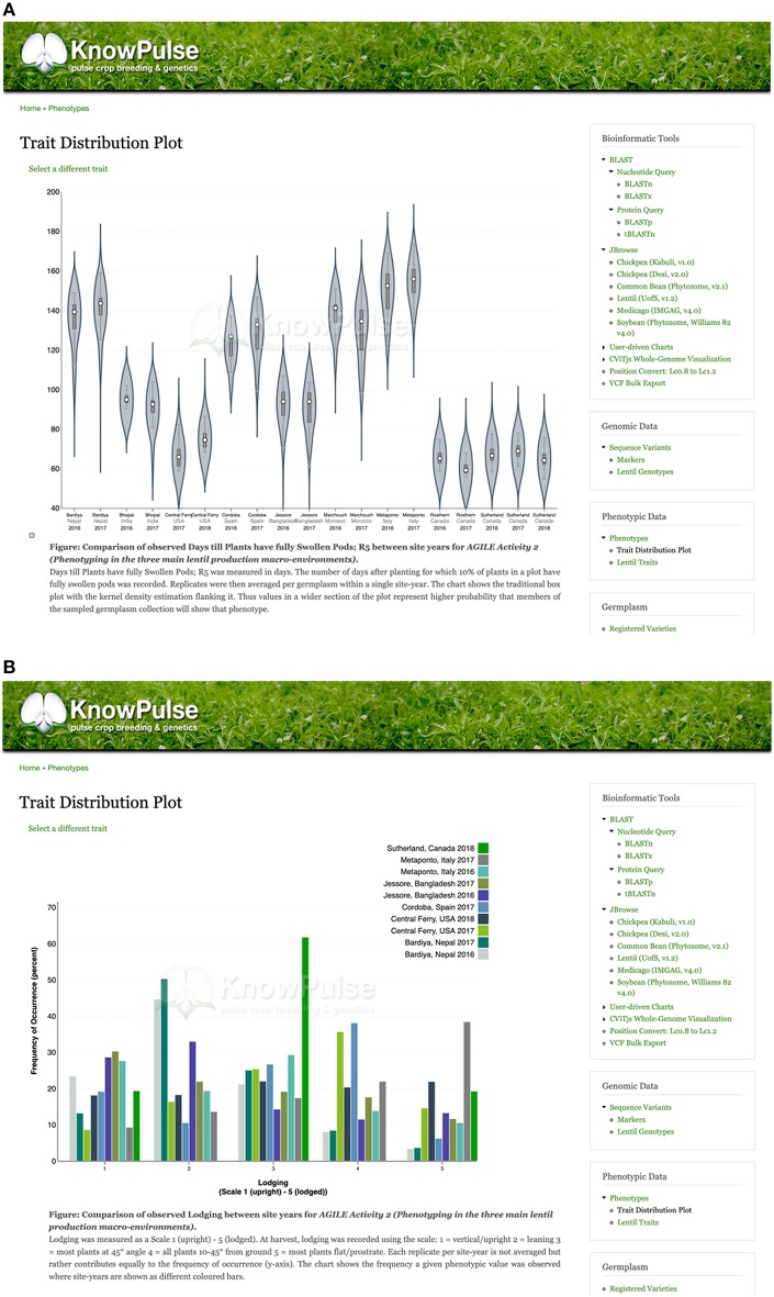
Figure 4.
Trait distribution plots summarizing phenotype data. Quantitative phenotypic data (A) is shown as a violin plot with site-year labeled by the x-axis and observed values labeled by the y-axis. This allows researchers to see the data structure (i.e., median, interquartile range, and 95% confidence interval) and distribution per site year. Qualitative phenotypic data (B) is shown as a multi-series histogram with each series representing a site-year and the observed phenotypes defined on the x-axis. The quantity of germplasm exhibiting each phenotype is shown on the y-axis allowing researchers to evaluate how prevalent a phenotype is in their population. These plots can be accessed via the trait distribution plot tool under Phenotypic data in the right side menu, as well as through trait, germplasm, and project pages with associated phenotypic data.

