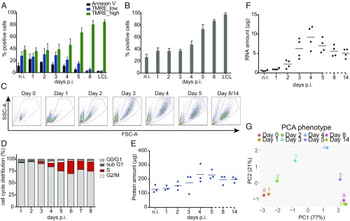
Fig. 1.
Metabolic and phenotypic parameters of B cells early after EBV infection. (A) The fraction of Annexin V+ and TMRE_low cells decreased in the course of EBV infection. The fraction of TMRE_high cells stayed constant until day 3 p.i., but increased starting on day 4 to amount to more than 80% 1 wk p.i. Mean and SDs from 4 independent biological replicates are shown. (B) During the first 3 d p.i., the fraction of cells that took up the glucose analog (2-NBDG) was constant. Starting on day 4 the fraction of glucose analog-positive cells increased up to 100%. Bars in the graph display mean and SD from 4 independent experiments. (C) Time-resolved FACS analysis of FSC-A (x axis) and SSC-A (y axis) criteria of EBV-infected cells. Uninfected B cells as well as newly infected cells on day 1 p.i. form a homogenous population of small cells with low granularity. The cells increase in size and reach maximal size and granularity 4 d p.i. Later, the cells adopt a more discrete population. On days 8 and 14 p.i. the cells are indistinguishable. (D) B cells after wt/EBV (2089) infection were incubated with BrdU for 1 h followed by intracellular staining with a BrdU-specific antibody. The cells were analyzed by FACS to determine their cell cycle distribution. Until day 3 the cells did not proliferate and stayed arrested in G0/G1 phase of the cell cycle. From day 3 p.i. the cells started to synthesize cellular DNA, as indicated by the presence of cells in the S-phase. Experiments were performed using 3 independent replicates. (E) Uninfected cells and cells infected with wt/EBV (2089) were collected daily and total protein lysates were obtained. The samples were measured using the Bradford assay. The graph shows the total amount of proteins (μg) obtained from 1 million cells. Measurements were performed every day after infection as indicated. The horizontal blue lines show the mean average from cells prepared from 3 different donors, individual samples are represented as single dots. (F) Amounts of total RNA (μg) obtained from 1 million cells were measured using a Shimadzu MultiNA instrument. Solid black lines represent the mean average from 4 different donors. Each donor is represented as a single dot. (G) The plot represents the PCA of the data in this figure and SI Appendix, Fig. S3 A and B (TMRE, 2-NBDG, cell diameter, DI, S-phase cell cycle distribution, protein content, and RNA content). The results from each experiment were normalized by the maximum value in each assay (SI Appendix, Materials and Methods). Next, PCA was performed and the first 2 components, PC1 (x axis) and PC2 (y axis), were plotted. The number in parentheses indicates the percentage of total variance explained by each PC. Colored dots represent samples infected with EBV at the depicted time points.

