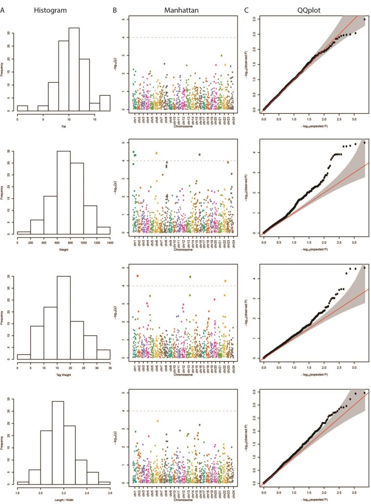
Figure 1.
(A) Distribution of each examined trait in our samples. (B) Manhattan plot demonstrating the locations across the chromosomes of the sea bream genome (horizontal axis) versus the –log (p-values) of the association between the genetic variants and phenotype (vertical axis). The higher the dots, the stronger the genetic association. The significance threshold was set to 10–4, in order to correct for multiple testing (dashed line). The different colors represent the different chromosomes. (C) Quantile–quantile (QQ) plot of the data shown in the Manhattan plot. The grey area represents the 95% simultaneous confidence bands. Red line is the diagonal (Y = X) or else how the observed data should be placed if they were normally distributed.

