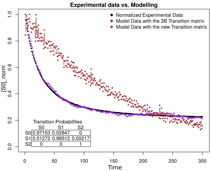
Appendix 1—figure 15. Simulation estimation chart of 1000 fluorophores.
The -axis is the normalization of fluorophores in the state (emission) in the time (-axis). The normalized data extracted from the images are shown in black. The purple and the brown dots represent the simulation of 1000 fluorophores as a Markov chain with the transition matrix that we propose and with the original 3B matrix, respectively. The transition matrix that we propose is shown in the bottom of the figure.

