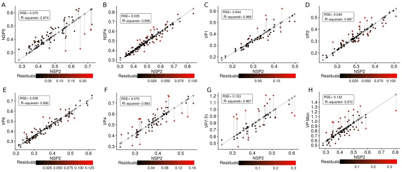
Appendix 1—figure 9. Residuals errors for each linear regression model.
Gray line represent the regression model, the points over the line are the predicted values (see Equation (31)) by the models, and the dots filled with a color gradient are the real values . The errors between the predicted and real values, , are represented as a gradient of colors as follows (from lowest/coldest to highest/warmest). For each model, the RSE and (R-squared) were included, note that this statistics are the same that were presented in Appendix 1—table 6. (A) , (B) , (C) , (D) , (E) , (F) , (G) , (H) .

