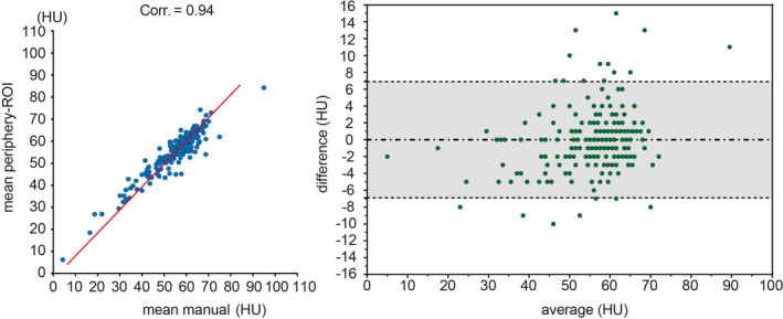
Figure 8.

The left panel shows the correlations between mean periphery‐regions of interests (ROIs) and mean manual ROI. The blue dots indicate the Hounsfield Unit (HU), and the red lines are the linear regression results. The right panel shows the Bland‐Altman plot between mean periphery‐ROI vs. mean manual ROI. The gray area indicates the 95% confidence interval. [Color figure can be viewed at wileyonlinelibrary.com]
