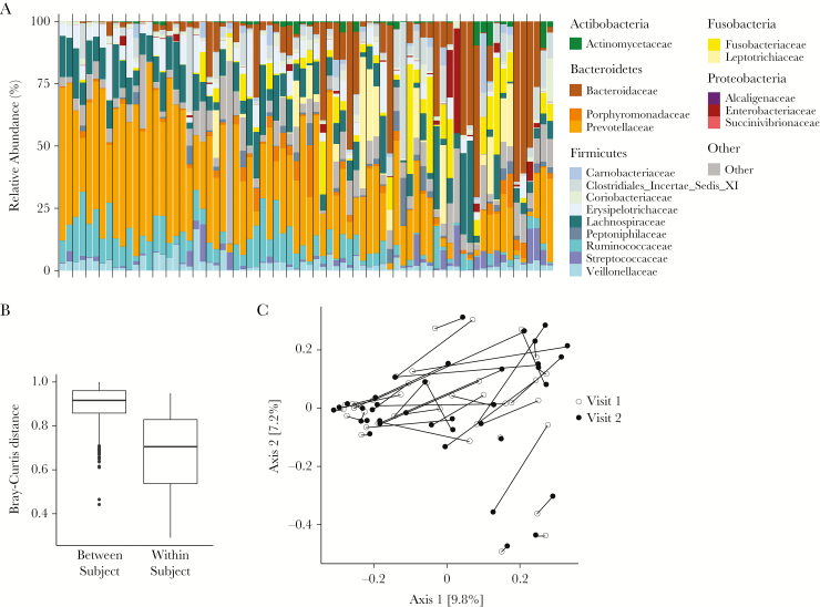
Figure 1.
Taxonomic distribution and similarity between samples across time points. A, Stacked columns show relative abundance as a percentage of total bacterial sequences at the family level. Each vertical bar indicates findings for a sample from 1 time point, and the vertical gray lines delineate different individuals. Families detected in <20% of the samples at a depth of 100 reads are aggregated into the category “Other.” B, Bar plot showing Bray-Curtis distances between participants (left) and between time points within the same participant (right). C, Principal coordinates analysis plot using the Bray-Curtis dissimilarity metric. Lines connect samples from visit 1 (open circle) and visit 2 (closed circle) within the same individual. Numbers in brackets denote the percentage variation explained by each axis.

