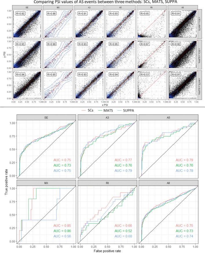
Fig. 10.
(Top) Comparing PSI values calculated using segment counts versus rMATS (first row), segment counts vs SUPPA (second row) and rMATS versus SUPPA (third row) on human samples from SwitchTx simulated dataset. Columns indicate seven types of alternative splicing events. (Bottom) Comparing ROC curves for differential alternative splicing using segment counts, rMATS and SUPPA for simulation dataset of switched abundance. Plots are stratified by event types. See Table 2 for number of events of each AS event type shown

