
Figure 3.
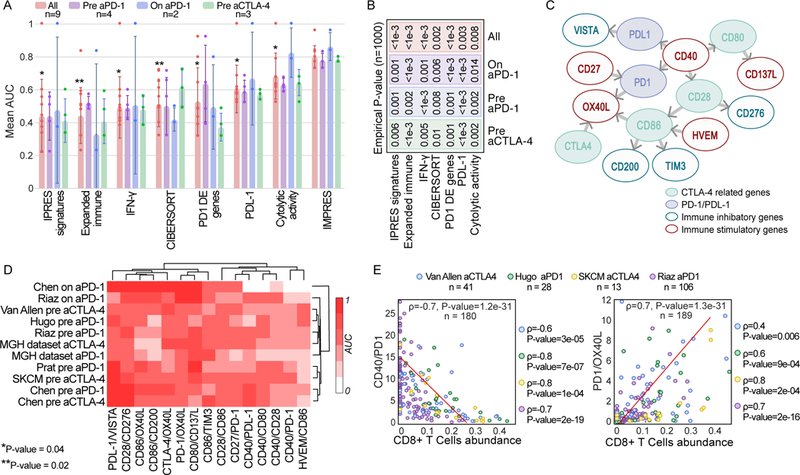
(A) AUC of IMPRES and other published predictors across 9 publicly available ICB treatment datasets grouped by treatment type and stage (pre and on stands for before and during ICB treatment). The one-sided Rank-sum P-values comparing the performance of each predictor evaluated to that of IMPRES over all datasets are presented (P-value of 0.002 is achieved when IMPRES AUC is larger than that obtained by the other predictor for all 9 datasets, and 0.004 when it is larger for 8/9 datasets). Bar centre is defined by the mean and error bars via SD. (B) The empirical P-values comparing IMPRES performance to that of each of the other predictors in the three different ICB treatment classes and for the aggregate of all datasets (using n=1000 permutations, the value of ‘<1e-3’ denotes that IMPRES’ prediction performance was superior to that of the predictor with which it was compared in all 1,000 repetitions). (C) A network representation of the 15 pairwise features comprising IMPRES. Each node represents an immune checkpoint gene and each edge describes a pairwise relation (an IMPRES feature). The direction of edge A -> B denotes that the higher expression of A vs. that of B is associated with better patients’ response. The color of the outline of each node denotes if it is inhibitory or activating and its fill color denotes whether it belongs to the PD1 or CTLA-4 pathways. (D) Clustogram (with average linkage function) of the individual predictive power of the 15 IMPRES features (based on their expression ratios) in each of the melanoma treatment datasets studied (the color scaling denotes the AUC obtained using each individual ratio as a response predictor, ranging from 0 to 1). (E) Scatter plots showing the correlation between CIBERSORT-inferred CD8+ T cells abundance (X-axis) and the gene expression ratios of two IMPRES features that are significantly associated with it (Y-axis); CD40/PD1 (upper panel) and PD1/OX40L lower panel). The Spearman ρ and associated P-values are shown for each ICB response data1,3,4,6 individually (on the right) and for all four datasets together (in the plot)