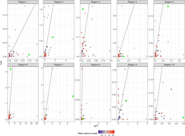
Fig 2. Squared errors from GFT and ILIp for HHS regions during the 2014/15 season.
The green data points show the error during the week of maximum weekly ILIf—the peak week—and the remaining data points are color coded by their distance from peak week. The black triangles show the mean error for the season. The black line is the y = x line; points below this line have larger errors from GFT than from ILIp. In all regions, the mean error from GFT falls below the line.

