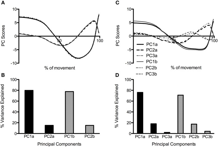
Figure 3.
PC waveforms along with percentage of explained variance for CMJnas (A,B) and CMJas (C,D) conditions. Data in (C) has been flipped to a negative peak to more clearly show comparison between the shape of waveforms in (A,C). PC1, 2, and 3a represent data obtained from PCA using only the first two PCs from each individual (analysis 4). PC1, 2, and 3b represent data obtained from group PCA for CMJnas, and CMJas (analysis 2).

