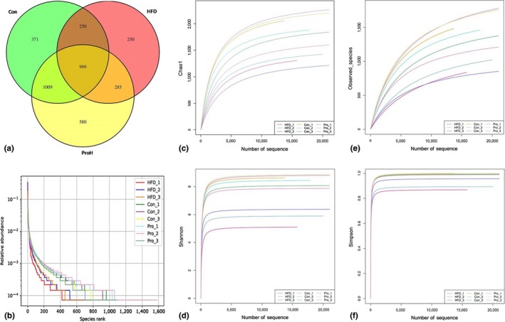
Figure 1.

Alpha diversity. (a) Venn Diagram: The Venn diagram intuitively showed the common or unique OTUs among Con, HFD, and ProH samples; (b) Rank Abundance Graph: Different color curves represent different samples. The abscissa is the OUT abundance level, and the ordinate is the relative abundance of OUT. The steepness of the curve expresses the difference between samples in OUT abundance. (c, d, e, and f) Rarefaction curves of Chao1, Shannon, Observed species, and Simpson: Observed species and Chao 1 indicate sample species richness; Shannon and Simpson indicate sample species diversity
