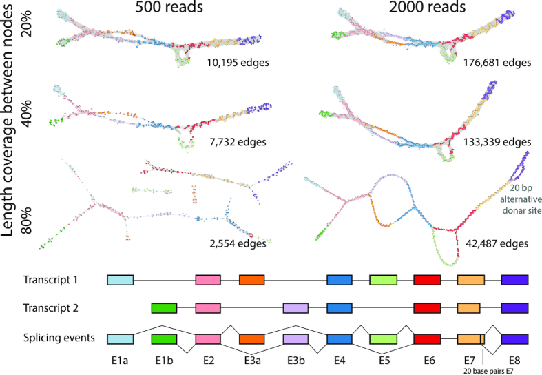
Figure 2.

Graph visualization of simulated data. Artificial transcript models representing two splice variants of a 10 exon gene were generated (bottom). When combined together, the two simulated transcripts incorporated an alternative start site (E1a, E1b), mutually exclusive exons (E3a, E3b), a skipped exon (E5) and an alternative 5′ donor site (20 bp shorter E7). Two levels of sequencing depth/transcript abundance were simulated, so as to provide a total of 500 or 2000 125 bp reads for the combined transcript models. RNA assembly graphs were then generated using a percentage similarity threshold of p = 98 and three settings for the threshold for the length of similarity (l = 20, 40, 80). The resultant graphs were visualized Graphia Professional using a 2D layout. Graphs are laid out in 2D and node colours represent the exon to which they map.
