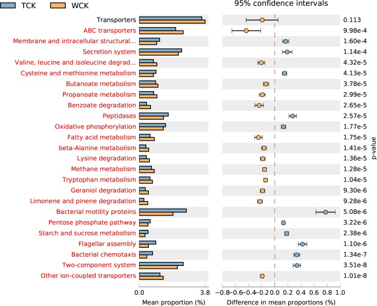
Fig 9. Top-25 functional abundance-difference analysis between TCK and WCK.
TCK denotes the antibiotic-treated PWNs in the control group. WCK denotes the antibiotic-untreated PWNs in the control group. The left side of the chart shows the abundance of different functional groups in the two groups of samples. The right side shows the difference in the ratio of the functional abundance in the 95% confidence interval. The functional group shown in red indicates p < 0.05.

