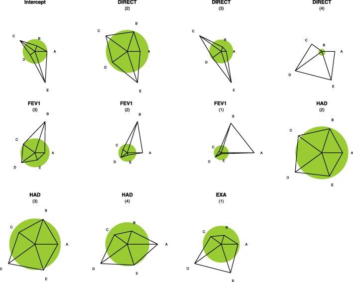
Fig. 1.
Effect Star Plots. Glyphs (effect star plots) shows the strength of associations between predictive variables and treatment categories. The star plot for each variable shows how strong the impact of the predictor on treatment choice is and what form it takes. The (shaded) unit circle around the center of each star corresponds to no-effect. A deviation from the circle shows the strength of the preference for one category as the deviation from the circle. If the ray is outside the circle, the increase in the predictor increases the probability of the corresponding category; if it is inside the circle, the increase in the predictor decreases the response probability. Stars are standardized such that the maximal length of a ray has the same value. This value also scales the radius of the unit circle. For example, consider the effect of the DIRECT variable: it is obvious that with increasing DIRECT, category E is more strongly favored while, in particular, the response probability for the A’s decreases. A category: no COPD treatment or short-acting bronchodilator(s) (SABA and/or SAMA) only; B category: LABA OR LAMA; C category: LABA+LAMA; D category: LABA OR LAMA + ICS; E category: LABA+LAMA+ICS

