Figure 2.
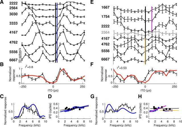
AAR neurons feature characteristic delays and characteristic phases. A–D, Example neuron with a linear phase–frequency relation over the entire frequency range. E–H, Second example neuron featuring two different linear regimes over the low-frequency and the high-frequency ranges. A, E, Tone-delay curves, stimulus frequencies indicated on the left margin (Hz). Curves were shifted on the y-axis for visual clarity. Note that the gray tone-delay curve in E was not significantly tuned for IPD. However, tuning in the neighboring low-frequency and high-frequency ranges was significant. The characteristic delay as computed from the tone-delay curves is indicated by the black line. The CD estimated from FFT of noise-delay functions is illustrated by the blue line (A, whole frequency range) and by violet and yellow lines (E, low-frequency range and high-frequency range, respectively). B, F, Noise-delay functions (black) and overlaid composite curves (red) representing the normalized sum of the tone-delay curves. The variance explained (r2, top left corner) by the linear sum was significant (p < 0.01). C, G, Frequency-tuning curves (black) and scaled FFT amplitude spectra (blue) of the noise-delay curves. Note that the peak position and size correspond well in C but not in G. The frequency-tuning curve measured at a constant ITD of 60 μs for this neuron underestimates the neuron's sensitivity to low frequencies, which is, however, obvious from the low-frequency tone-delay curves in E and the FFT amplitude spectrum. D, H, Phase–frequency relation derived from tone-delay curves (best IPDs, black circles) and FFT phase spectra of noise-delay curves (blue circles). While phase estimates of both methods corresponded well, the FFT-based method obtains superior frequency sampling. Regression through phase data estimated from tone-delay curves (black line) and different ranges of the FFT phase spectra (color code here and in subsequent figures: blue, entire frequency range; violet: low-frequency range; yellow, high-frequency range). The slope of the regression represents the CD and the offset reflects the CP. For CD and CP values see Results. Error bars represent SEM. Contralateral leading ITDs are represented by positive ITDs here and in all figures.

