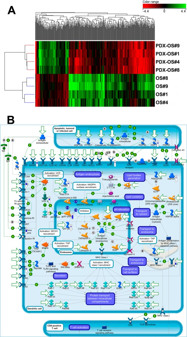
Figure 3.
(A) Heatmap of OS samples obtained using the list of 397 genes (see Supplementary Table 3) that are differentially expressed (adjusted p < 0.05) between primary tumors and PDX. Genes (columns) and samples (rows) were grouped by hierarchical clustering (Manhattan correlation). High- and low- expression is normalized to the average expression across all samples. (B) Map of “Immune response_Antigen presentation by MHC class I” pathway, which is the top scored (lowest p value) map based on Genego pathway enrichment analysis. Experimental data (OS PDX/primary tumor ratio) from microarray experiments are visualized on the map as thermometer-like figures. Significantly upregulated genes show upward, red bars, while down-regulated genes show downward, blue bars.

