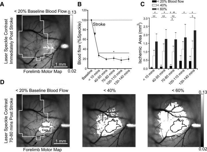
Figure 2.
Evolution of the targeted stroke. A, Laser-speckle image displaying blood flow of surface vasculature with a black outline of the corresponding motor map and the area with <20% blood mean blood flow after stroke in white. B, Percentage change in blood flow at the 76 × 76 μm region of interest at the vessel targeted for occlusion. C, The surface area of cortex with area corresponding to various thresholds of blood flow. D, Areas corresponding to 20, 40, and 60% blood flow superimposed onto laser speckle images at 70–80 min poststroke with the most ischemic area (<20% blood flow) outlined. Error bars in all graphs are SEM. Significant differences relative to baseline #p < 0.05, ##p < 0.01 and between groups *p < 0.05, **p < 0.01.

