Figure 9.
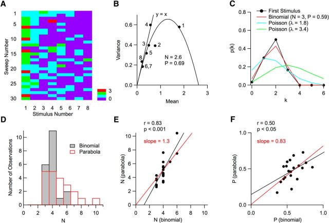
Counts of vesicular release events per AP follow binomial statistics. A, Matrix of vesicular release counts (color coded) as a function of stimulus number (columns; 100 Hz stimulation) and trial number (rows). B, For each stimulus number, the mean and variance of the number of released vesicles was determined in a 5 ms period after individual stimulations (dots). Stimulation numbers are indicated; note that the vesicle counts for the sixth and seventh stimuli are identical, so that the corresponding dots are superimposed. The resulting curve can be fitted with a parabola indicating a number N = 2.6 of releasing units and a maximum release probability (for the first stimulus) P = 0.69. For late stimuli, experimental points are close to the y = x line that would be predicted for a Poisson model. C, Here, the probability distribution p(k) to observe k vesicular release events is displayed for the first stimulus in A. As can be seen in the first column in A, k varies between 0 and 3, with 5 observations of k = 3, and 0 observation of k > 3. The experimental data (dots) are compared with two Poisson models, one with the same mean release number as the data (λ = 1.8; blue) and the other with the same failure number as the data (λ = 3.4; green). In both cases, poor fits are obtained. In contrast, the binomial model approximates the data closely (red; N = 3; mean probability P = 0.59; see Materials and Methods). D, Distributions of N values obtained with the variance–mean parabola (red) and with a binomial fit (black). E, Plot of the N value obtained by extrapolation of the parabolic fit to variance data, as in B, as a function of binomial N, obtained from the stimulus with maximum release probability by the method illustrated in C. Depending on the experiment, this maximum occurred for the first stimulation (as in the case shown in A), or for the second stimulation. The 2 N estimates are significantly correlated (black regression line; p < 0.001) and the regression line passing through the origin (red) has a slope of 1.3. F, Corresponding plot of the maximum release probability with the two methods. Again, the two estimates are significantly correlated (black regression line; p < 0.05) and the regression line passing through the origin (red) has a slope of 0.83.

