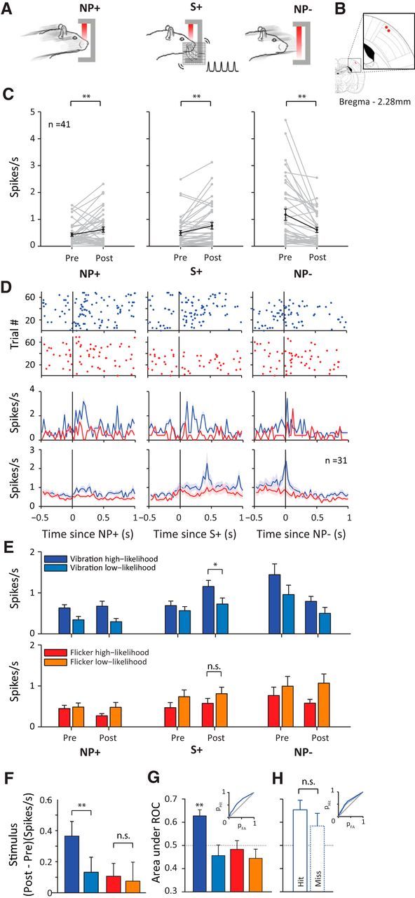
Figure 6.

Single-unit activity in vS1. A, Schematic representation of behavioral time points of interest: NP+, nose-poke onset; S+, stimulus onset; NP−, nose-poke offset. B, Location of final recording sites in two rats on the rat brain atlas (Paxinos and Watson, 2007). C, Single-unit (n = 41) activity at each behavioral time period. Pre and Post represent average spike rate in a 200 ms window before and after each discrete behavioral event, respectively. Each gray line represents a neuron. Black line represents the average across all neurons. Error bar indicates SEM. D, Top, Raster plots showing spiking activity of the example neuron aligned to each behavioral event. Red dots represent spikes during visual session; blue dots represent spikes during whisker session. Middle, Perievent time histogram of the example neuron binned at 30 ms. Shaded areas represent SEM across trials. Bottom, Averaged perievent time histogram of all recorded neurons (n = 31) isolated in both a whisker and visual session. Shaded areas represent SEM across neurons. E, Average spike rate during before and after the event (nose-poke onset, stimulus onset, nose-poke offset). Trials are separated based on the type of stimulus (vibration or flicker) and the session type (whisker or visual) in which it was presented. Dark blue represents vibration trials in a whisker session; light blue represents vibration trials in a visual session; red represents flicker trials in a visual session; orange represents flicker trials in a whisker session. Error bars represent the SEM across neurons (n = 31). F, Analysis of stimulus response. Color notations are the same as in E. Each bar represents the mean difference in spike rate across neurons, calculated as the difference of poststimulus spike rate from prestimulus spike rate. G, Analysis of stimulus detectability. Color notations are the same as in E. Each bar represents the mean area under ROC across neurons. Inset shows the ROC curve for detection of vibration high-likelihood stimulus. H, Area under ROC from G plotted separately for the hit versus miss trials of vibration high-likelihood stimulus. Inset shows the ROC curves for hit trials (solid blue line) and for miss trials (dotted blue line).
