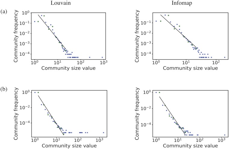
Fig 12. Community size frequency distribution.
Community size frequency distribution for (from top to bottom): (a) Turkey and (b) the Netherlands. The figures are plotted on log-log scale. For each country we show the results from two methods; Louvain on the left and Infomap on the right. The blue cross represents the data, the green dot represents the data binned using a logarithmic binning, and the black line is a linear fit to the binned data.

