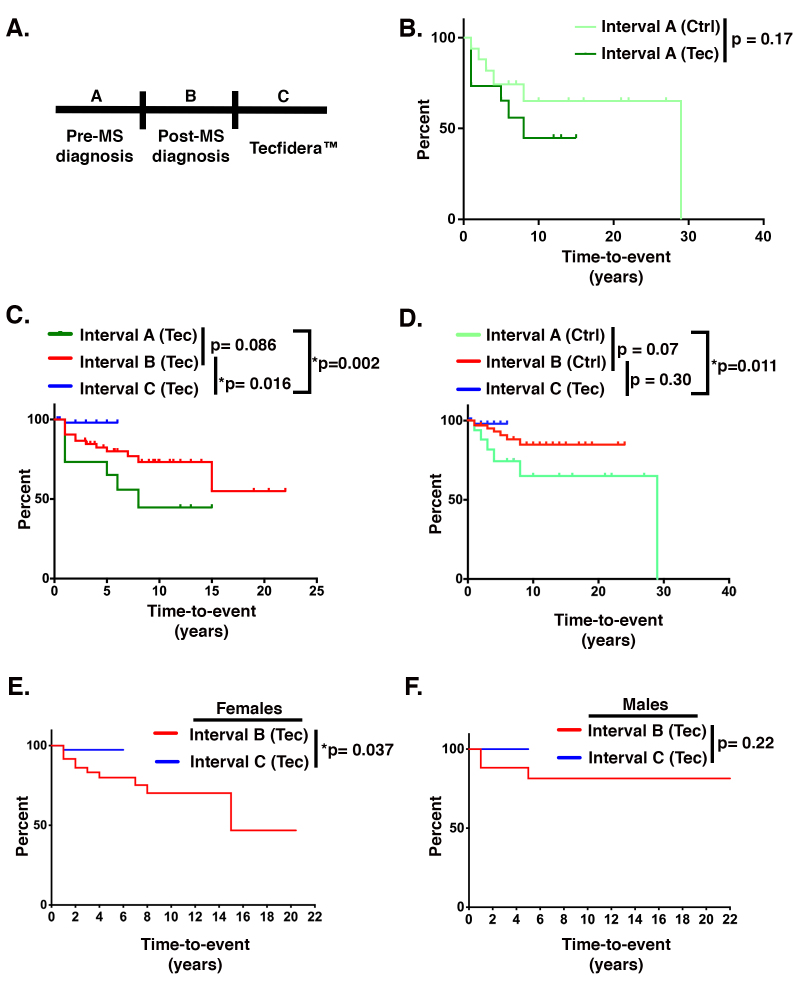
Figure 6.
Tecfidera™ maintenance therapy mitigates optic neuritis in patients with RRMS. A: Schematic of time-to-event intervals analyzed in the retrospective chart study. Interval A corresponds to the time before a diagnosis of multiple sclerosis (MS), Interval B corresponds to time following a diagnosis of MS and the beginning of any treatment, and Interval C corresponds to the time during which patients were maintained on Tecfidera™. All subsequent graphs in this figure (B–F) are cumulative time-to-event curves derived with the Kaplan–Meier nonparametric estimation. Percent on the y-axis indicates the estimated probability of a new episode of optic neuritis not to occur before a given time represented in years on the x-axis. As the overall percentages decrease, the likelihood of shorter times to a recurrence of optic neuritis increases. Consequently, the curves closer to the horizontal axis correspond to patients being sicker. The differences between the Kaplan–Meier curves were assessed with a nonparametric log-rank test. p values less than or equal to 0.05 are considered statistically significant and are marked with asterisks. B: Time-to-event curve comparing Interval A between the control patients (Ctrl) and the patients maintained on Tecfidera™ (Tec). C:Comparison within the Tecfidera™-treated cohort of the time to a recurrence of optic neuritis before an MS diagnosis (Interval A, dark green trace), after MS diagnosis (Interval B, red trace), and during maintenance on Tecfidera™ (Interval C, blue trace). P values are shown for comparisons of Interval A versus B, Interval B versus C, and Interval A versus C. D: Comparison within the control cohort of the time to a recurrence of optic neuritis before (Interval A, lime green trace) and after (Interval B, red trace) a definitive diagnosis of MS and the initiation of treatment. This graph also compares the time to a recurrence of optic neuritis for the Tecfidera™-treated cohort during maintenance therapy on Tecfidera™ (Interval C; blue trace) to each interval of the control cohort (Interval A; lime green trace and Interval B; red trace). E, F: Analysis of Interval B versus C for the Tecfidera™ patient cohort divided into women (E) and men (F). For all graphs, asterisks denote statistical significance for p0.05.

