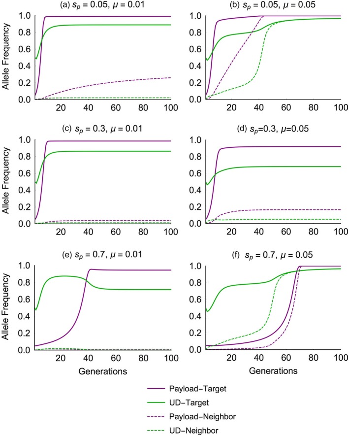
Figure 7.

Time‐series plots show the allelic frequencies of the payload (allele Ct, purple lines) and the underdominance with Cas endonuclease (allele Bt, green lines) in the target (solid lines) and the neighboring (dashed lines) populations. Individual plots show dynamics with low (µ = 0.01, left column) or high (µ = 0.05, right column) migration rates, and with different payload costs (across rows). Dynamics of the underdominance construct without Cas (allele At) are similar to that of allele Bt and are not shown for visual clarity
